
UI editor (configurator design)
The UI editor controls how the customer-facing configurator looks: layout, navigation, typography, shape, and motion. Changes apply to the configurator your visitors use in both iFrame embed and Script inject modes.
The manager can be used in English or Dutch. Each setting below lists the Dutch label in parentheses as well, so the page works whichever language you have selected.
Where to find it
Manager → Design → Configurator (Configurator).
These settings are company-wide: they apply to every configurator you publish, not to one product. The product picker in the top bar only chooses which product to render in the preview.
Design holds four related pages: Branding (logo, colours, typeface, button corners — shared by everything), Configurator (this page), Email (the emails a customer receives, see Submissions & outputs) and PDF (the quotation PDF, see Template editor).
The editor shows the settings panel on the left and a live preview on the right. Edit a setting and the preview updates immediately.
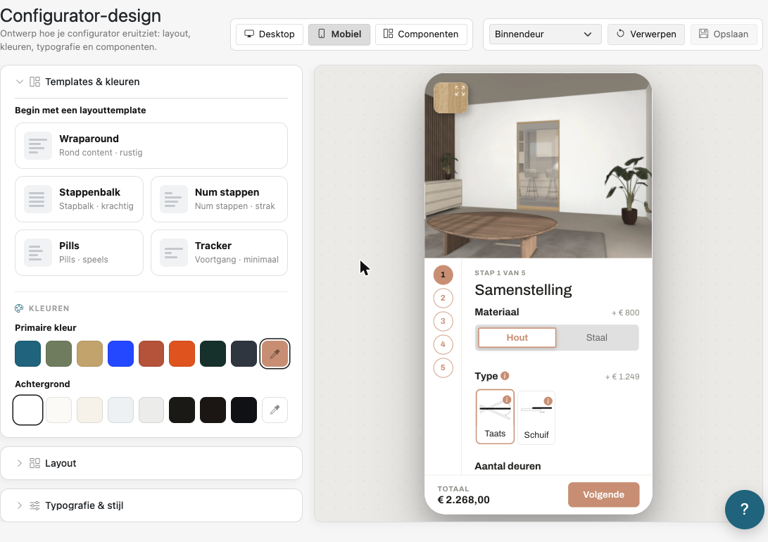
Top bar
| Control | Dutch | What it does |
|---|---|---|
| Preview device | Desktop / Mobiel / Componenten | Preview the configurator as desktop, as mobile, or inspect individual components. |
| Preview product | Previewproduct | Choose which live product is rendered in the preview. It does not change what you are styling. |
| Discard | Verwerpen | Drop unsaved changes. |
| Save | Opslaan | Publish the design to every configurator of your company. |
Keyboard shortcuts: Cmd/Ctrl + E toggles the Components view, Cmd/Ctrl + Shift + M toggles the Mobile preview.
The settings are grouped into three collapsible panels: Layout, Typography & style, and Animations & spinner.
Colours
Colours are no longer set here. Your primary colour and background live on Design → Branding, because they are shared with your emails. Change them there and this preview follows immediately.
1. Layout (Layout)
Step-menu placement — "Where does the step menu go?" (Waar komt het stappenmenu?)
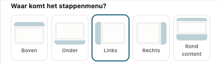
| Option | Dutch | Result |
|---|---|---|
| Top | Boven | Horizontal menu above the content |
| Bottom | Onder | Horizontal menu below the content |
| Left | Links | Vertical menu on the left |
| Right | Rechts | Vertical menu on the right |
| Around content | Rond content | Menu wraps the content (Wraparound style) |
Step-menu style — "Which step menu suits you?" (Welk stappenmenu past bij je?)
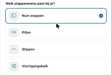
| Option | Dutch | Appearance | Available at |
|---|---|---|---|
| Numbered steps | Num stappen | Numbered circles in a column | Left, Right |
| Pills | Pillen | Compact, numbers with labels | Every placement |
| Dots | Stippen | Minimal, small dots | Top, Bottom, Left, Right |
| Tabs | Tabs | Clickable tab bar | Top, Bottom |
| Step bar | Stappenbalk | Blocks side by side | Top, Bottom |
| Breadcrumbs | Broodkruimels | Step › step › step | Top, Bottom |
| Progress bar | Voortgangsbalk | Bar with "step 2 of 4" | Top, Bottom, Left, Right |
| Minimal | Minimaal | Just "Step 2/4" as text | Top, Bottom |
| Accordion | Accordeon | Steps fold around the content | Around content |
| Cards | Kaarten | Each step is its own card | Around content |
Pick the placement first: the list only shows the menus that fit the chosen placement. If your current menu does not fit a newly chosen placement, it switches to Pills, which fits everywhere.
Action bar (Actiebalk)
The action bar holds the next button and the price.
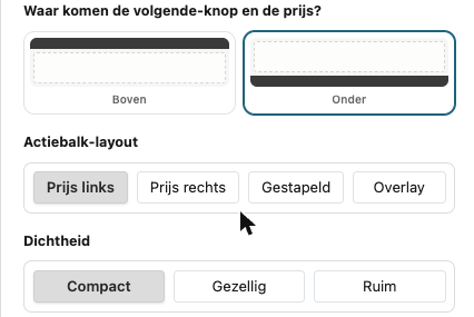
| Setting | Dutch | Options |
|---|---|---|
| Position — "Where do the next button and price go?" | Waar komen de volgende-knop en de prijs? | Top (Boven) or Bottom (Onder) |
| Action bar layout | Actiebalk-layout | Price left (Prijs links), Price right (Prijs rechts), Stacked (Gestapeld), Overlay (price shown in the 3D overlay) |
3D overlay colour (Kleur 3D-overlay (iconen en prijs))
The colour of the icons and the price shown over the 3D view. White (default) (Wit (standaard)) is on by default; switch it off to pick a Custom colour (Eigen kleur).
Density (Dichtheid)
Compact, Cozy (Gezellig) or Roomy (Ruim): how much spacing the configurator uses around and between its options.
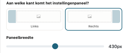
Settings panel (Instellingenpaneel)
The area where the customer makes their selections.
| Setting | Dutch | What it does |
|---|---|---|
| Side — "Which side does the settings panel go?" | Aan welke kant komt het instellingenpaneel? | Left (Links) or Right (Rechts) |
| Panel width | Paneelbreedte | Slider from 340px to 520px, in steps of 10. Wider gives options more room; narrower gives the product preview more space. |
2. Typography & style (Typografie & stijl)
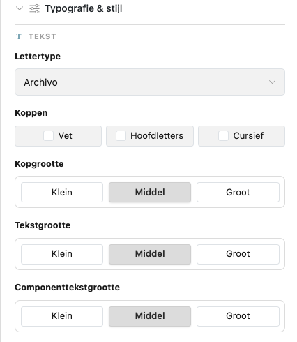
Text (Tekst)
| Setting | Dutch | Options |
|---|---|---|
| Headings | Koppen | Bold (Vet), Uppercase (Hoofdletters), Italic (Cursief) — combine as needed |
| Heading size | Kopgrootte | Small (Klein), Medium (Middel), Large (Groot) |
| Text size | Tekstgrootte | Small / Medium / Large — base body text |
| Component text size | Componenttekstgrootte | Small / Medium / Large — text inside controls (option labels, buttons) |
Keep the three sizes in a clear hierarchy (heading > body > component) for balanced, readable screens. Component text is the easiest to set too small on mobile.
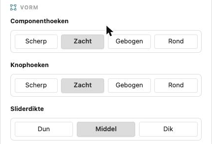
Shape (Vorm)
| Setting | Dutch | Options |
|---|---|---|
| Component corners | Componenthoeken | Sharp (Scherp), Soft (Zacht), Curved (Gebogen), Round (Rond) |
| Slider thickness | Sliderdikte | Thin (Dun), Medium (Middel), Thick (Dik) |
Sharper corners read as technical; rounder corners read as soft and friendly. The typeface and the button corners are set on Branding — they apply to your emails too.
3. Animations & spinner (Animaties & spinner)
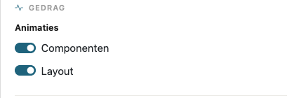
Behaviour (Gedrag)
| Setting | Dutch | What it does |
|---|---|---|
| Animations — Components | Animaties · Componenten | Transitions on controls (selecting options, hover) |
| Animations — Layout | Animaties · Layout | Transitions when steps and panels change |
Turn animations down for a snappier, utilitarian feel; up for a more polished feel.
Spinner (Spinner)
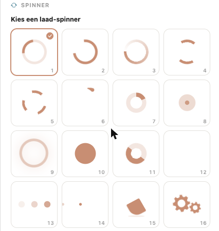
The loading indicator shown while the configurator initialises. Choose one of 16 styles (Kies een laad-spinner).
Saving & publishing
Click Save (Opslaan) to publish the design to every configurator of your company. Because styling lives in the manager and not in the embed code, you can restyle a live configurator without touching the host website. Use Discard (Verwerpen) to drop unsaved changes. Cmd/Ctrl + S saves as well; Cmd/Ctrl + Backspace discards.
If you leave the page with unsaved changes, the manager asks what to do: Discard changes (Wijzigingen weggooien), Keep editing (Verder werken) or Save and leave (Opslaan en weggaan).
Tips
- Set the primary colour on Branding first; it cascades through the accents here and in your emails.
- Check both the Mobile (Mobiel) and Desktop preview — panel side, panel width, and action-bar position read differently per screen size.
- Use the Components (Componenten) preview mode to inspect individual controls in isolation.
Further reading
- Branding — logo, colours, typeface and button corners
- Product editor — the content the configurator renders
- Getting started with Manager
- iFrame embed
- Script inject